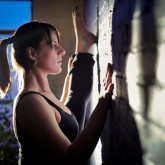
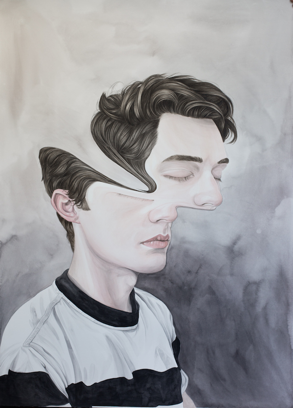
New Zealand artist Henrietta Harris marks her United States solo debut with “The Hum” at the Robert Fontaine Gallery May 9 during Wynwood’s Second Saturday Art Walk. Using watercolor and sometimes ballpoint pen, she creates near-photoreal portraits that are seemingly incomplete, veering towards the surreal. Oftentimes her subjects faces are distorted, dislocated or even erased altogether. With her portraits’ deliberate glitches set against voided backgrounds, her paintings calls for deeper examination of her subjects. It’s as if they’ve been momentarily transported to a borderless landscape where they seem both large and small with disregard for time and space.
We caught up with Harris to discuss her exhibition, her medium and what’s next for the artist. The Hum runs through May 17.
Tell us about what we can expect from “The Hum.”Â
The best body of work I’ve ever done, with larger, detailed, more accomplished paintings and drawings. I’ve had longer than ever before to work on the pieces for a solo show so I took my time at the beginning and I think it paid off.
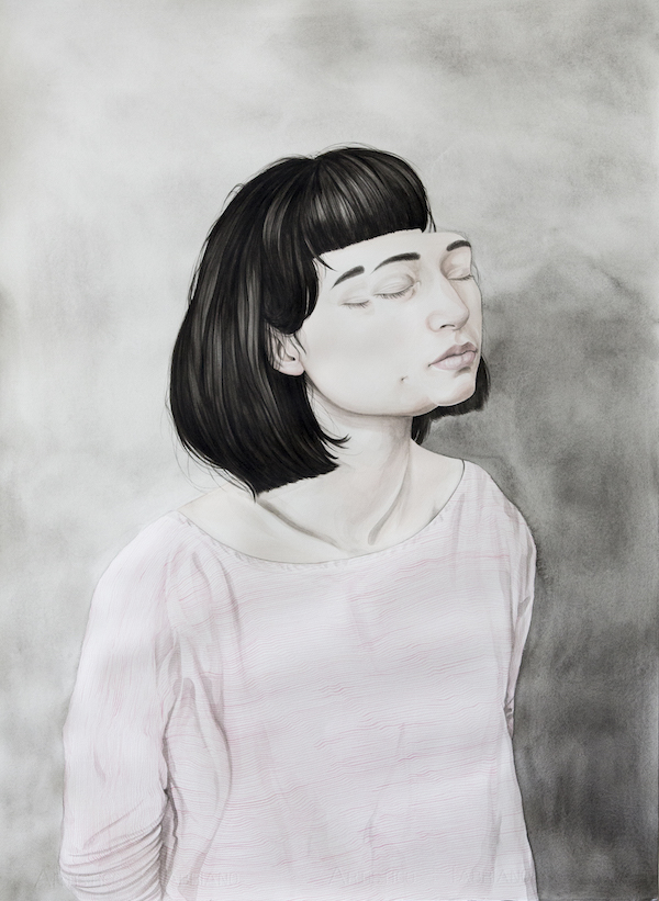
The Hum, 22 x 30”, Watercolor on paper, 2015
What does the show title mean?
The title The Hum is loosely based on the phenomena of a low-frequency humming not audible to all people, where the person hearing it goes loopy from the persistent sound seemingly no one else can hear. I also like the ambiguity of the phrase, the way the words look written down, the feeling of simultaneous movement and stillness.
You work with watercolors. Why that medium and how does it inform your subjects?Â
I taught myself watercolors after art school at a time where I didn’t really have much room to spread out particularly, and was travelling around a bit so they were easy to transport, compact and tidy. it wasn’t really a conscious decision but rather a practical one.
Are there particular challenges or benefits you encounter with watercolors?
I’m not sure they’re designed to paint in the scale I’ve been using them in for this particular body of work, but it’s been a good learning curve. They’re non-toxic and odourless which is good in the small shared studio I work from, and soothing to paint with. There’s something nice about repeating the layers over and over until I’m happy.
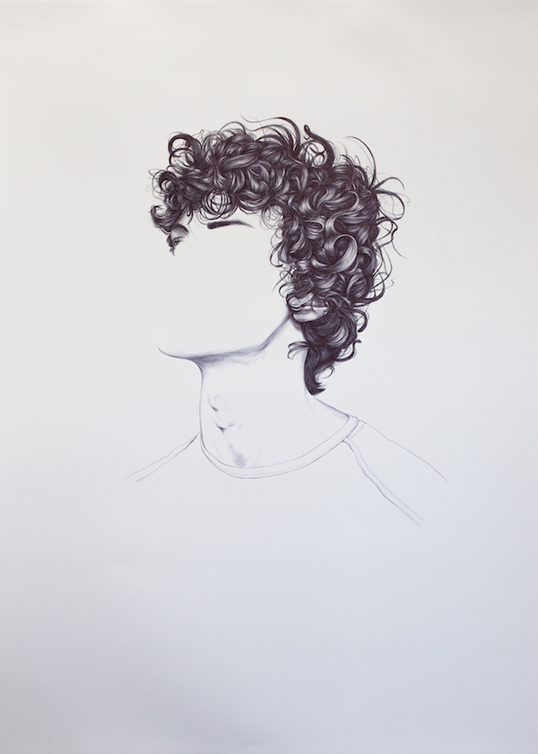
#4, Landmarks & Features Series, 22 x 30”, Ballpoint pen on paper, 2015
Tell us about your subjects and the decision to oftentimes distort their faces or heads with what looks like a brushstroke. What are you trying to convey?Â
It was something I came up with about four years ago while designing a poster for the musician Ariel Pink- I wanted to give the portrait a psychedelic feeling. I then took it further and played around and fine-tuned the look. I like trying to mix abstraction and figurative ideas together and conjuring up emotions, giving a feeling of movement, sadness, hope, the usual! I really like experimenting with cancelling, blocking out, or changing portraiture. Challenging the norm, that sort of thing.
And how does that technique work, technically speaking?
It’s a secret. I get a bit of help from photoshop.
Makes Sense, 29.5 x 41”, Watercolor on paper, 2015
Your subjects are often painted onto a rather nebulous background. Tell us about that decision.
I love the look the watercolor paint gives to backgrounds, no matter how many layers you do it still looks fragile and delicate and I don’t like placing my subjects in actual landscapes or rooms- I like the other worldly and focused feeling they get having the backgrounds like that.
What’s next for you?
I’m in a group show in Tokyo at the end of May, and after that I have no idea! The Hum has taken up my brain for months.